
Our A to Z of Wide Format – D is for Design
Applications, Bleed, RIP Software…. We get asked lots of questions about the world of Wide Format on a daily basis. At Signmaster we are here to help and our lovely team of experts have pulled together a handy A to Z guide answering the most frequently asked questions.
Introducing the Signmaster A to Z of Wide Format
This is a series of helpful blogs, guides and articles that we hope you will find useful. We will post a new blog every fortnight and we’d love to know what you think so please comment or drop us an email. We’d love to hear from you!
This week it’s all about Design.

D is for Design by Lucy Kehoe
Design for me, is easily one of the most underrated skills within the print industry – people just don’t see or understand the value of good design anymore. I believe great design, transformed into print can be really magical……but unfortunately there are a lot of designs out there which might look great on the computer screen but that just don’t translate to print well and before you know it, the magic has been lost.
Designing for wide format print definitely needs a lot more thought and attention than designing a business card or leaflet, mainly because there are so many additional factors to be considered.
My top tips for designing Wide Format print design are as follows:
Top Tip Number 1: Positioning
Consider the positioning of the finished print and your design, right at the very start of the design process. For example:
- 1. Is it a road side sign and therefore you only have seconds for anyone to be able to read it?
- 2. Is it going across multiple windows with big gaps in between each panel which you might not initially realise?
- 3. Will it be sat next to another piece of print which is a specific colour / style to which you need yours to compliment?
All of these questions need to be answered before getting started, as the impact they can have on the finished design can be huge and the whole concept / messaging you hoped to achieve is, lost.
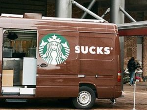
I saw this image online and felt it was too funny not to include! It shows how much extra thought is required with the positioning of wide format print in EVERY position it would find itself in.
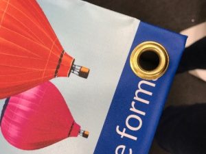
Top Tip Number 2: Material
What material will your design be printed on…….and with that in mind, what extra things do you need to think about before starting?
The classic example here is PVC / Mesh Banners and artwork having text running where an eyelet is about to be positioned to allow the banner to be hung – see example picture below!
Another example would be poster Trappa frames where you can lose 1 inch of your A1 poster on the inside of the frame. When you design your A1 poster on your screen, it is easy to forget that.
Top Tip Number 3: Resolution
Wide format print is often BIG and it is so easy to get caught out with images which don’t have the resolution to be enlarged to the size required. You never have to consider this with business cards and leaflets – most images, even if low resolution will look fine on that size of finished product but roller banners or signage can quickly look awful if the pictures used don’t have a big enough resolution. Ideally where possible use vector files and then however big it goes, you will never have an issue.
Top Tip Number 4: Trimming
A lot of wide format print comes in panels, due to the overall size of it being outside of a lot of printer’s capacity, whether that is pop up stands where you have panels that clip together or vehicle graphics where you have side doors or rear doors with design crossing over split panels. In order to make your design look its best, you need to consider where these breaks are and try to prevent letters falling right in the middle of them……which means they need to be trimmed and suddenly the integrity of the design is lost. I always stress the importance of just tweaking the artwork to avoid trimming through key bits of artwork, as with the best intentions you are always going to lose a little of that letter!
Those are my top 4 tips for designing for wide format print. It is always best to fully understand the specification of the job before starting……don’t just ask what size it needs to be!
RECENT POSTS
Subscribe to our Blog
SEARCH


Head Quarters & Northern Office
Unit 3
Waymills Industrial Estate
Whitchurch
Shropshire
SY13 1TT
UK
- Head Quarters: 01948 662669
